Full 8th Edition spoiler!

A

Apollo

Guest
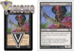
The new layout is still dreadful, I'm afraid. It hasn't grown on me a bit. Will it make the difference between whether a new player stays or not? No. Will it benefit older players? No. So Yech.

And I really dislike the new Grave Pact artwork. Don't ask me why, but it just looks so... so... generic, maybe?
 
R

Reverend Love

Guest
Are you implying a spooky ghostly figure, scythe in hand ominously pointing towards a grave isn't original!?!?!?!
 
N

Nightstalkers

Guest
WTF! I'll start with Apollo:

You are right about the fact that most of the artwork still looks lighter than the card should imply.

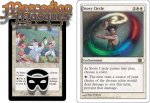
Story Circle!:

When I first layed me eyes upon the artwork of Story Circle, I laughed out loud at the depiction of a crude storytelling action going on. With this new card artwork, I'm afraid that the card should be called Circle of Protection: choose a color

well, what do you expect from Allan Polack?
 
N

Notepad

Guest
The new white boxes really make the green and black cards horrid to look at when compared to the old ones, and all these examples show it. They could have at least kept the color-tinged text boxes, but I guess they wanted the white-wash three-billion fan sellout flavor...so that way you can mix and match with YuGiOh and Star Trek.

Strangely enough, has anybody seen the Trek 2nd Edition? It bears a similarity to Magic XP...
 
N

Notepad

Guest
You think they're too bright, eh? I guess you're right there...

Which means the actual foil red cards will actually look just like YuGiOh cards.

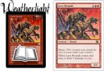
That is awesome Lava Hounds is back. I used to think that card was great back in the day (Weatherlight) and am glad I'll be able to get them again and put them in decks.
 
A

Apollo

Guest
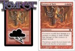
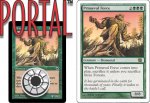
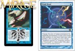
OK, is it just me, or does every one of the originals look better than the new version? Seeing them side-by-side has just made me even more disappointed in the new set.
 
T

train

Guest
I'm with you Apollo...

If it looks like poop...
acts like poop...
and smells like poop...

It must be...
 
N

Nightstalkers

Guest
Just glad they're keeping the old black borders is what I care much about.

[Deleted attachment 'cause it's way too big - Spidey]
 
N

Notepad

Guest
Originally posted by Apollo
OK, is it just me, or does every one of the originals look better than the new version? Seeing them side-by-side has just made me even more disappointed in the new set.
I couldn't agree more. The anal warts can grow, but they will never be as fast or as powerful as us. Wait, that's a ripoff from the Matrix. End result: They suck.

Nightstalkers, what does that Trinity shot have to do with 8E???
 
N

Nightstalkers

Guest
Man, I don't know. Too stoned to tell.


Trinity looks better than the new MTG cards?
 
N

Nightstalkers

Guest
you missed a 4/2, haste, return to hand at end of turn, (1)(R)(R)?

I can see how thats intrieguing....

can we give it trample?
 
N

Nightstalkers

Guest
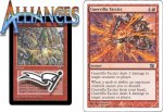
Factoid: Alliances was the last set to feature multiple pieces of art on each common card.


First Gorilla Tactics looked like it should be in Portal Three Kingdoms... Now it looks decent.
 

Attachments

N

Notepad

Guest
Originally posted by Nightstalkers
First Gorilla Tactics looked like it should be in Portal Three Kingdoms... Now it looks decent. [/B]

This one looked like crap even more than the old one. What are you talking about, Nightstalkers? The best of them was the one where the guy was setting up the tripwire. Much better looking than this YuGiOh looking art on the 8E one.
 
Top