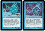
Trickery Charm

Which art for Trickery Charm is better?

  • The art as it ended up. Shell at water.

    Votes: 0 0.0%
  • The original whimsy art. Clown and butterfly.

    Votes: 1 100.0%

  • Total voters
    1
N

Notepad

Guest
While I don't like blue, I found Magic Arcana today to be very annoying.

http://www.wizards.com/default.asp?x=mtgcom/arcana/386

Whimsy Charm would have been more fun, but I guess the name change is tolerable. However, the art change is not. The whimsical art is much more fun, and captures the spirit of the old Magic I remember. The art it ended up with, is, well...crap.

Take a look, which one do you prefer?
 

Attachments

I

Izaryo

Guest
the clown is.. what can i say, clown? good that WotC didn't use that. it's stoooopid :eek: :eek:
 
T

Troll

Guest
It looks like Pennywise from "It".

"We all float down here...":D
 

Spiderman

Administrator
Staff member
Yeah, I don't like the clown either in the art. I like clowns in general, but I can't see how it belongs here (I can't get to the article because of some java runtime error in the script :rolleyes: )
 
N

Nightstalkers

Guest
What the holy f*** is that!

:eek: ... :eek:


Either ICP has been hired at WotC, or they just like to show off that we could get worse art.
 
T

Thallid Ice Cream Man

Guest
I like Whimsy Charm (the name and the illustration) better. If you're going to make a crap common just for the sake of a cycle at least make it stand out in some way. Trickery is too generic. It's obvious that this one mana instant is trickery.

But when you're working with an art director who basically fired Rebecca Guay, what can you say.
 
N

Notepad

Guest
>> at least make it stand out in some way

This is what makes the original art better. At least it was creative, rather than sort of sitting there with nothing really unique going on in the background.
 
O

orgg

Guest
I think the clown was too out of place, but why That Damned Cranford (art director and, as far as I can tell, tasteless in artistic variety) thought a butterfly didn't fit onto the card I have no idea.
 
N

Notepad

Guest
If they would have used a more period-looking clown, such as a pierot, it would have looked fine. It also looks better with the butterfly and the wood behind it.
 
A

Apollo

Guest
The original was nothing amazing, but the new one is just boring. The old one had some flavor, a little weirdness, a little something to set it apart. Now it's... a shell.

And Whimsy Charm sounds better than Trickery Charm, too.
 
N

Notepad

Guest
Makes ya wonder why their craptastic art director didn't just say "Get rid of the clown and add more butterflies" or something like that. But no, they just crap it down in quality...
 
T

train

Guest
I think the artist is like me - he knows how strong Blue really is, and was only painting the feeling we all have at that time when Blue shows all it's might...
 
N

Notepad

Guest
Wait, which one are you talking about, train? The actual artist who had a great idea, or the craptastic art director (also an artist) who made the picture change into poo?
 
N

Notepad

Guest
The clown *idea* is somehow fitting for the charm, though it should have been a harlequin instead. Damn that water background.

Of course, using the butterfly art would have led to a slippery slope...

In a year's time we'd see Butterfly Tokens!!! ARGH!!!
 
N

Notepad

Guest
I absolutely bet you we'd be seeing Butterfly tokens. Of course, that's no more absurd than Squirrel tokens...
 

Spiderman

Administrator
Staff member
They were funny too; at least the concept was when they first came out with that giant squirrel pic... :)
 
Top