New Comic: "Cards on the Brain"

N

Notepad

Guest
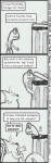
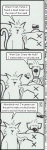
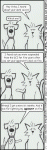
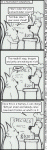
Well, because of trying out a new art style with Fast Effect, I ended up making a second comic strip. It might just end up replacing Fast Effect because I like making these much more, as I actually get to draw.

Please take a look and leave feedback. I really wonder what people will think of this new style of comics, and the humor contained within. I'll try to post the first six or so strips of this comic within a short time, but here are thr first two for now:
 

Attachments

Spiderman

Administrator
Staff member
Eh, better, but still attached to the old art style. This art style is good, but it may be too good for your strip style... I feel they should be more animated, like what you see in your paper. For three panels, the old art style with it's limited movement and more "primitive" art was better.
 
N

Notepad

Guest
Little by little, this particular style keeps improving. These two here look like the Fast Effects, but once I get that new pen in they'll look a lot better.

You're right, in that they're related to the FE style of limited movement. I started working on that in 4-6, actually (with the soon to be posted "Dead Human" strip showing a lot more movement than I've done in this of FE's style before). Working on getting more movement in, as I get used to drawing these characters in this style.

But you think three frames is too few for a more animated style than FE?
 

Spiderman

Administrator
Staff member
Well, so far, with the movement you have going, I do. Plus the characters seem so big that they take up a lot of the panel space.

That's just me though :)
 
N

Notepad

Guest
Well, this one has a lot of movement, and definitely shows how the new comic is taking steps away from FE. CotB now has six strips ready for submission...so enjoy. :D
 

Attachments

N

Notepad

Guest
Oh, and on PoD this new art style quest has caused me to make the comic "Hell Hand" (as opposed to a God Hand) which is a single-panel comic with a style very inspired by The Far Side (and like The Far Side, there will be plenty of trips to hell, but the comic will not focus on that locale). They'll be used as spot art in my PoD articles.

What do you think of this upcoming strip, to be placed in a Breakin Da DCI Rules article?
 

Attachments

Spiderman

Administrator
Staff member
Both comics are good, although the art for the single panel one seems a bit more "amateurish" (kinda like something your kid would want you to put on your refridgerator :) )
 
N

Notepad

Guest
I agree, the scan looks like total fecal matter. It looked pretty nice on paper. But then the scanner, coupled with pixelation, played hell with the art.

Maybe I'll just stick to black and white for Hell Hand if I can't get the coloration to where it shows up good on the scanner. Here is Hell Hand 1, which will be (hopefully) appearing with my next article at PoD. How bad does this one look?
 

Attachments

N

Notepad

Guest
Actually, by comparing the posted images here to the paper ones, I figured out the two things that are crappifying the Hell Hands:

-The contrast between white paper and light pencil lines is dramatically sharpened when scanned. Normally, making colors more vibrant is a good thing, but here it makes my pencil strokes much more obvious, to the point of looking like crayons. Doh!

-The black ink lines are saturated by this same color enhancement, so they look runny like they too are crayon, or really bad penciling. Compare to the CotBs which have no color saturation and instead have pixelized lines.

I can fix the first problem by just being much more thorough with coloring, and really using that white pencil (funny how using a white pencil will solve the problem of white showing up on scans). The second problem I think will continue to bite me in the rump as long as I use colors with this scanner.
 
N

Notepad

Guest
Oops, forgot to post the Dead Human strip because I was so astounded with my little epiphany there about the color enhancement actually messing everything up.

I've submitted all six CotBs to CPA now, so hopefully their cruel humor won't get them rejected. Here, as mentioned a lot, is my favorite of the initial six (with Stupid Foreigner being a close second) is the Dead Human strip.
 

Attachments

N

Notepad

Guest
And now for a step backwards, the third CotB, which was the first use of the new pen for better lines, but where I was still stuck in the FE style of limited movement...
 

Attachments

N

Notepad

Guest
And now for the continuity-sake's sequel to Dead Human, the fifth CotB, rounding out all six for a forum surfing sneak peek at the ones I submitted today. :D

I hope CotB is well-recieved. They sure are a hell of a lot of fun to work on, as opposed to FE, which was just cut and paste...cut and paste...bleh. With any luck, I can bring some FE characters over to CotB.

At the same time, maybe I can give away the index and template files for FE, and see if anybody wants to take it over. It is VERY EASY to make, after all. :D ;)

edit: I realize this, number five here, has some flaws in the text bubbles. I'll get that crap cleared up for the submission version asap. :rolleyes: :eek: :rolleyes:
 

Attachments

Spiderman

Administrator
Staff member
Typo in the "brugers" above.

The comics won't go up until next week 'cause Ed's away.

Question though: if you're posting them now, is there a need for them to go up on the front page?
 
N

Notepad

Guest
Not only the typom but the letters in the first frame had transparency that caused the background to show through the little holes in O and E, for example.

And yeah, I'm still submitting them front page. These here were just to show off the style. If there was adverse reaction to the style, I'd scrap the suckers. But seeing as how nobody's hating this the way they did the winking cat, I'll make some more and submit them before these six go front page. Of course, future batches will likely not get sneak peek posting like this. These were feedback samples. :D
 
S

Shiro, Time Devourer

Guest
Originally posted by SeFRo
And now for the continuity-sake's sequel to Dead Human, the fifth CotB, rounding out all six for a forum surfing sneak peek at the ones I submitted today. :D

I hope CotB is well-recieved. They sure are a hell of a lot of fun to work on, as opposed to FE, which was just cut and paste...cut and paste...bleh. With any luck, I can bring some FE characters over to CotB.

At the same time, maybe I can give away the index and template files for FE, and see if anybody wants to take it over. It is VERY EASY to make, after all. :D ;)

edit: I realize this, number five here, has some flaws in the text bubbles. I'll get that crap cleared up for the submission version asap. :rolleyes: :eek: :rolleyes:
Just when I thought you couldn't have lost any more of your touch, you go and do something like this.


AND TOTALLY REDEEM YOURSELF!

5/5.

Good job!
 
N

Notepad

Guest
Thanks much, Shiro. :D Glad to have finally found a style that's working not only for me, but for readers, as well.

And as to Orgg's suggestion of making a zombie hand character, it is possible in this comic. The dead human's unused hand will certainly be showing up in the next batch. ^.^
 
N

Notepad

Guest
Thanks. But, both what? There were six initial CotB strips, and another four on the way (once I scan them in and upload them).

Another of my new favorites is upcoming, in which Ben Bleiweiss makes an appearance, but as a giant butt. Oh, the fun of drawing him as a big, giant butt! :D
 
Top