Fallen Angel!

  • Thread starter Azreal the Soulmaster
  • Start date
A

Azreal the Soulmaster

Guest
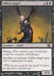
Anyone who has played against me in real life knows that I constantly speak out over the travesty of art that was the 7th edition Fallen angel. It was simply awful. It wasn't even proportioned right. but 8th edition apparently learned and they've commissioned a new piece that is just as good if not better than the amazing art done my Anson Maddocks. I'm quite happy with the art in 8th edition. There are some pieces that would be better untouched(especially Elvish Champion, when will they learn that D. Alexander Gregory's piece can't be improved upon?), but the overall art is good.
 

Attachments

N

Notepad

Guest
I agree, it looks cool, but it also looks like a vampire. At least they finally have good art that answers how this fallen angel can fly.
 
N

Nightstalkers

Guest
Another thing, whats with keeping the original flavor text?


Can't we have something else too?
 
T

Thallid Ice Cream Man

Guest
It's nice and minimalistic in scope. Good work, Matthew Wilson.
He seems to have outgrown his previous fixation with taking the large breasted heroine comic book stereotype and putting small breasts on her.
 
A

Azreal the Soulmaster

Guest
actually thats not the original flavor text. that was created in 7th. the original flavor text(if it can be called original since the legends version had no flavor text) was from 5th edition and had a quote from Baron Sengir. Somethin along the lines of "angels are an extention of existence, and there is far more dark than light" something like that.

I like the fact he included wings, but showed that the wings are crumbling. it makes more sense, at least to me anyway.:)
 
N

Nightstalkers

Guest
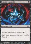
I hate the new Unholy Strenght artwork.


But we were never did like it after they got rid of the pentagram :rolleyes:
 

Ferret

Moderator
Staff member
I always preferred the original Fallen Angel artwork from Legends/Chronicles. The stitches on her back where the wings were removed gave it more of the "fallen" look than just the ragged ones on the 8th version...

-Ferret

"...no matter what the artwork, though, it's a solid card!"
 
M

Mr_Pestilence

Guest
Wings aside, I love the new Fallen Angel look. It doesn't really look like a vampire to me, but more of a daylight-challenged cyber punk kinda thing.

Same for Soul Collector? Why are the vampires now into leather and S&M? (Not that that's a bad thing...)
 
T

train

Guest
Why are the vampires now into leather and S&M?
It has to do with WOTC and Frat houses...;) :p

The only thing cool about 8th - is the foils and the way they don't make the whole picture foil...

"The actual design stinks..."
 
O

orgg

Guest
I think that current Unholy Stregnth is one of the best looking ones they've done. Definatly in the top three.

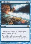
I also ~LOVE~ the new deflection flavor text!
 
A

Azreal the Soulmaster

Guest
Originally posted by train
"The actual design stinks..."
I don't mind the new design. It reminds me of The Lord of the Rings cards, and they look really cool. its not the classic design, but it doesn't bother me.

I really like the new unholy strength, I always thought the original, even with the pentagram in the background looked kinda lame. I like the flavor text on it too.

I was told a while back by Beth, coproprietor of Games, Comics, and Stuff(plug:D ), that a friend of hers did the art for the 8th edition deflection, and to let her know what I thought about it. Well, I really like it. I think its a really interesting interpretation to have the wizard deflecting the spell through his own body.
 

Spiderman

Administrator
Staff member
Not really partial to the new Fallen Angel. Definitely don't like the wings and the bald look does make it look cyber/future punkish.

Like the Deflection art. Looks cool.

"Eh" on the Unholy Strength, although really, what can you do with a card that's been around forever. I guess it's okay... having four arms isn't something I'd associate with it though.
 
T

Troll

Guest
I still don't like the overall design of the new card faces but they do look awesome foiled. I got a foil Unholy Strength. It truely looks unholy.

As for the Fallen Angel pic, I think it is 10,000 times cooler than the original and a billion times better than the 7th artwork.

I don't know if they made you pass your cards after you registered them but the cards I opened the best thing I had was a Underworld Dreams. We passed two to the left and I ended up with a Coat of Arms, Bird of Paradise, and a Wrath of God :eek: :p :eek: !!! The rest of my cards sucked especially white so the the only rare I ended up using for my deck was the BoP. I ended up going 3-3.
 
T

train

Guest
Well Troll... We tied for percentages...

You went 3-3 - 50%
I went 0-0 - 50%(I judged)

But we gave away a box to 1st... What was the main prize where you played?
 
T

Troll

Guest
There were 6 rounds of Swiss break to top 8. The prize structure was:
1st- box of 8th
2-4-1/2 box
5-8-1/4 box

My buddy went 4-1-2 and made top 8 but was eliminated 1st match. Later we discovered that he was only playing with 35 cards. WHat a lucky *******. I wish he would've got deck checked and disqualified. Cheating bastard!:mad: :mad: :mad:
 
I

Izaryo

Guest
haven't seen the original but that is better than the seventh edition one
 
Top